
A brief matplotlib API primer:
Colors, Markers, and Line styles.
- Figures and Subplots.
Ticks, labels, legends, and saving plots to file.
Different plots using matplotlib, pandas, and seaborn:
- Line & bar plots.
Histograms & density plots.
- Scatter or point plots.
Facet grids and categorical data.
Overview:
Making informative visualizations (sometimes called plots) is one of
the most important tasks in data analysis. It may be a part of the
exploratory process—for example, to help identify outliers or needed
data transformations, or as a way of generating ideas for models.
Python has many add-on libraries for making static or dynamic
visualizations, we will mainly be focused on matplotlib and libraries
that build on top of it. matplotlib is a desktop plotting package
designed for creating (mostly two dimensional) publication-quality
plots.
The project was started by John Hunter in 2002 to enable MATLAB-like
plotting interface in Python.
Over time, matplotlib has spawned a number of add-on toolkits for data
visualization that uses matplotlib for their underlying plotting. One of
these is seaborn, which we will explore later in this
presentation.
A brief matplotlib API Primer:
With matplotlib, we use the following import convention.
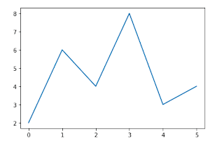
After running it in jupyter, we can try creating a simple plot.If
everything is set up right, a line plot like below appear.
import pandas as pd
import numpy as np
import matplotlib.pyplot as plt
data=np.array([2,6,4,8,3,4])
plt.plot(data)
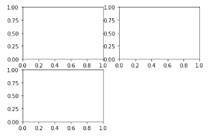
Figures and subplots:
Plots in matplotlib reside within a Figure object. You can create a
new figure with pit.figure().
plt.figure() has a number of options; notably, figsize will guarantee
the figure has a certain size and aspect ratio if saved to disk. One
can’t make a plot with a blank figure.One have to create one or more
subplots using add_subplot().
ax1 = fig.add_subplot(2, 2, 1)
This means that the figure should be 2 x2 (so up to four plots in
total), and we’re selecting the first of four subplots (numbered from
1).
The objects returned by fig.add_subplot are Axessubplot objects, on
which one can directly plot on the other empty subplots by calling
each one's instance method.
fig=plt.figure()
ax1=fig.add_subplot(2,2,1)
ax2=fig.add_subplot(2,2,2)
ax3=fig.add_subplot(2,2,3)
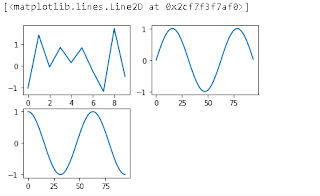
x=np.arange(0,3*np.pi,0.1)
fig=plt.figure()
ax1=fig.add_subplot(2,2,1)
ax2=fig.add_subplot(2,2,2)
ax3=fig.add_subplot(2,2,3)
ax1.plot(np.random.randn(10))
ax2.plot(np.sin(x))
ax3.plot(np.cos(x))
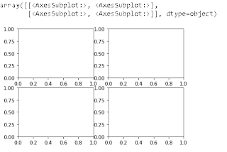
fig,axes=plt.subplots(2,2)
axes
Colors,Markers,and line styles:
Matplotlib’s main plot function accepts arrays of x and y coordinates
and optionallyastring abbreviation indicating color and line style.
There are a number of color abbreviations provided for commonly used
colors, but one can use any color on the spectrum by specifying its hex
code (e.g.,'#CECECE’).
One can see the full set of line styles by looking at the command
help(pit.plot).
Line plots can additionally have markers to highlight the actual data
points.
help(plt.plot)
Output=
Help on function plot in module matplotlib.pyplot:
plot(*args, scalex=True, scaley=True, data=None, **kwargs)
Plot y versus x as lines and/or markers.
Call signatures::
plot([x], y, [fmt], *, data=None, **kwargs)
plot([x], y, [fmt], [x2], y2, [fmt2], ..., **kwargs)
The coordinates of the points or line nodes are given by *x*, *y*.
data=np.random.randn(30)
data
Output=array([-0.55620921, 1.15354551, 1.88428619, -0.25361657, 0.11720929,
0.99380999, -1.61673998, 0.15259621, 1.07661434, 0.57335323,
1.51775676, 2.16336357, 0.29821075, 0.80887232, -0.23170136,
-0.15509185, -2.13596732, -0.25341181, -0.81853445, -1.75597032,
-2.66753714, -1.10821393, 1.40548605, 0.06021546, -0.4025957 ,
-0.18417526, 3.20519396, -1.15411711, 0.58264083, -0.070976 ])
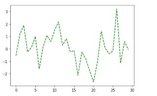
plt.plot(data,linestyle='--',color='g')
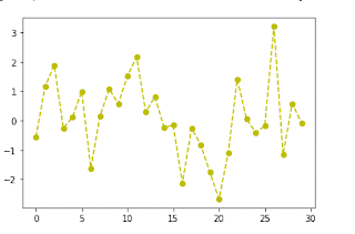
plt.plot(data,color='y',linestyle='dashed',marker='o')
Ticks, Labels and Legends:
The pyplot interface, designed for interactive use, consists of methods
like xlim, xticks, and xticklabels. These control the plot range, tick
locations, and tick labels respectively.
To change the x-axis ticks, it’s easiest to use set_xticks and
set_xticklabels. The former instructs matplotlib where to place the
ticks along the data range; by default these locations will also be the
labels. The rotation option sets the x tick labels at a any degree
rotation.
Lastly, set_xlabel gives a name to the x-axis 1 and set_title the
subplot title.
Legends are another critical element for identifying plot elements. One
pass the label argument when adding each piece of the plot.
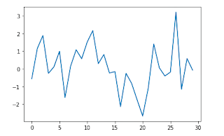
fig=plt.figure()
ax=fig.add_subplot(1,1,1)
ax.plot(data)
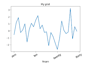
fig=plt.figure()
ax=fig.add_subplot(1,1,1)
ax.plot(data)
ax.set_xticks([0,10,20,30])
ax.set_xticklabels(['zero','ten','twenty','thirty'],rotation=30,fontsize='large')
ax.set_title("My plot")
ax.set_xlabel("Stages")
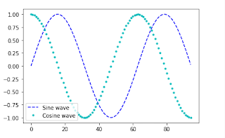
fig=plt.figure()
ax=fig.add_subplot(1,1,1)
ax.plot(np.sin(x),'b--',label="Sine wave")
ax.plot(np.cos(x),'c.',label="Cosine wave")
ax.legend()
Saving plots to file:
One can save the active figure to file using plt.savefig. This method
is equivalent the figure object’s savefig instance method.
For example, to save an PNG version of a figure, we need only type:
plt.savefig(‘image.png')
The file type is inferred from the file extension. So if one used .pdf
instead, one would get a PDF.
There are a couple of important options that are used frequently : dpi,
which controls the dots-per-inch resolution, and bbox_inches, which can
trim the whitespace around the actual figure.
plt.plot(data,color='k',linestyle='dashed',marker='o')
plt.savefig("image11.png")
Different plots using matplotlib, pandas, and seaborn:
Bar plot
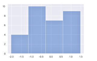
Histogram
Scatter plot
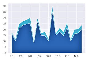
Stack plot
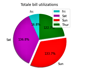
Pie plot
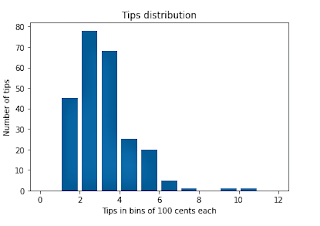
Plotting using Seaborn
import seaborn as sns
sns.set()
data=np.random.randn(30)
sns.distplot(data,kde=0)
I hope that you have understood this topic, I have tried my best, This is a vast topic but I have covered it in short....
Best Regards from,
msbtenote:)
THANK YOU!!!


Comments
Post a Comment
If you have any query, please let us know